Example - Influence of Particle Size Distribution
Influence of Particle Size Distribution
These data are from a low permeability chalk oil-producing field. Water was injected above fracture propagation pressure in the field. This is the only case available where particle count and distribution were measured for the Total Suspended Solids in the injected produced water. Information available were particle concentration, distribution and size data, as well as injection rate data and Oil-In-Water concentration. There was no pressure data or any indication of which well the data came from. Due to this constraint, a complete analysis of the data proved to be difficult. Yet, some observed trends and correlations can be seen. The following table shows typical TSS injected into the well on any given day.
Size
(micron) |
Counts
(1/0.5 l) |
Concentration
(mg/l) |
| 2 |
190000 |
25 |
| 5 |
36000 |
75 |
| 10 |
4000 |
67 |
| 15 |
386 |
22 |
| 20 |
34 |
4.5 |
| 25 |
5 |
1.3 |
| 30 |
1.2 |
0.5 |
| 35 |
0.2 |
0.14 |
This table shows that the particle size varies from 2 to 35 microns. Most of the particles fall in the smaller range of 2 microns, but the concentration is dominated by the slightly larger 5 and 10 micron particles.
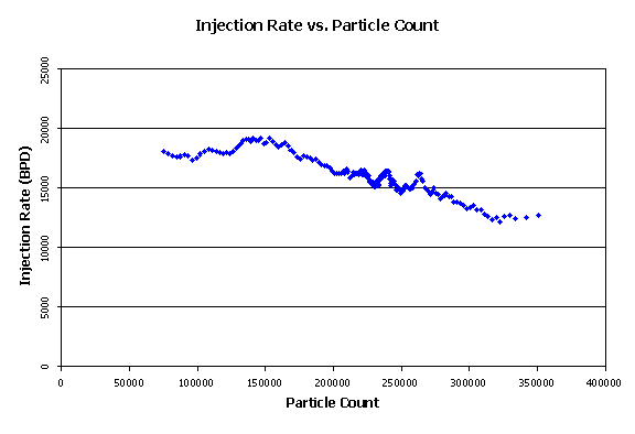
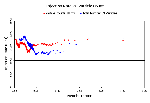
Plotting the injection rate for every day against the particle count of the day, gives Figures 1 through 9. These plots show:
-
the injection rate on any given day versus the total particle count,
-
followed by the injection rate against each particle size. They are ordered from the smallest particle size to the largest.
|
View Figure 1:
|
Injection Rate vs. Particle Count.
|
|
|
|
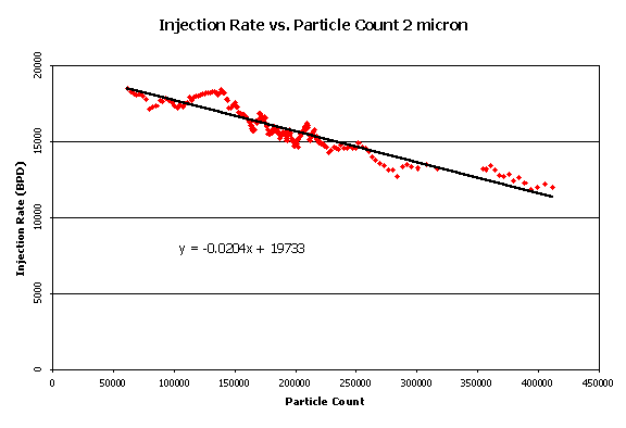
View Figure 2:
|
Injection Rate vs. Particle Count for 2 micron particles.
|
|
|
|
View Figure 3:
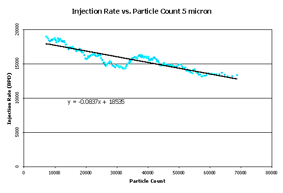
|
Injection Rate vs. Particle Count for 5 micron particles.
|
|
|
|
View Figure 4:
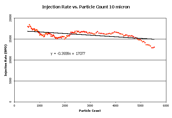
|
Injection Rate vs. Particle Count for 10 micron particles.
|
|
|
|
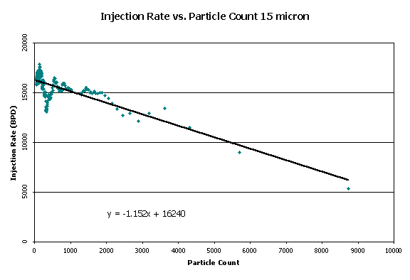
View Figure 5:
|
Injection Rate vs. Particle Count for 15 micron particles.
|
|
|
|
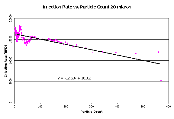
View Figure 6:
|
Injection Rate vs. Particle Count for 20 micron particles.
|
|
|
|
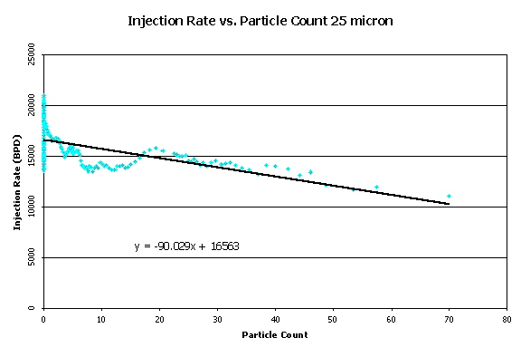
View Figure 7:
|
Injection Rate vs. Particle Count for 25 micron particles.
|
|
|
|
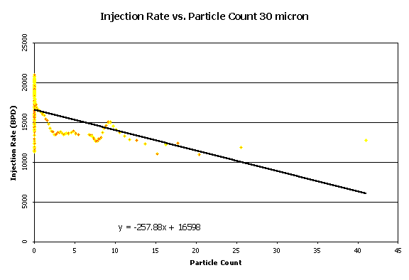
View Figure 8:
|
Injection Rate vs. Particle Count for 30 micron particles.
|
|
|
|
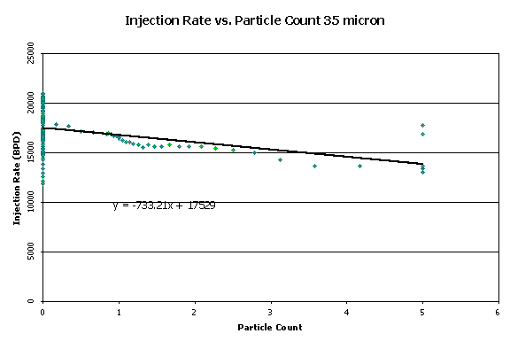
View Figure 9:
|
Injection Rate vs. Particle Count for 35 micron particles.
|
|
|
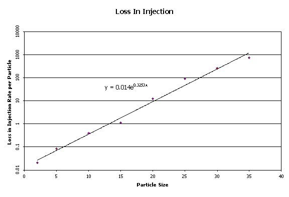
After performing the above analysis for each of the particle sizes, a linear fit was arbitrarily assumed to exist between the particle count and the injection rate. Fitting a trend line through each of these plots, a slope and an intercept were determined. The intercept for each was found to be varying around 17000 BPD. The slope seemed to be decreasing as the particle size increased. This suggests that larger particle sizes would cause a larger decrease in the injection rate per added particle. To attain a correlation between the loss in injection rate per particle and the particle size, each of the slopes was plotted against the respective particle size. The result can be seen in Figure 10.
|
View Figure 10:
|
Loss in Injection Rate as a function of Particle Count and Distribution.
|
|
|
In Figure 10, there is a reasonable correlation between the loss in injection rate per particle and the particle size on a logarithmic scale. An exponential function can be fitted to this.
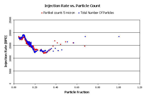
In Figure 11, the particle size with the highest concentration was considered and compared to the total particle count. The particle fraction is calculated by normalizing the particle count with the largest particle count of all of the measured data points for that particle size.
|
View Figure 11:
|
Injection Rate vs. Particle Fraction (5 microns).
|
|
|
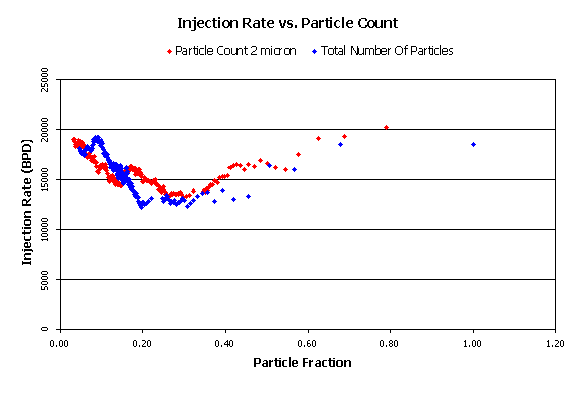
Figure 11 shows that (for this case), the injection rate has the same dependence for the 5 micron particles as for the total particles. Comparing Figure 11 with Figures 12 and 13, for 2 micron and 10 micron sizes, the dependence is not as strong although the trend still exists. Although there are more 2-micron particles than 5-micron particles, the 5-micron particles seem to be more dominant with their larger size.
|
View Figure 12:
|
Injection Rate vs. Particle Fraction (2 microns).
|
|
|
|
View Figure 13:
|
Injection Rate vs. Particle Fraction (10 microns).
|
|
|
Back
Main
Documents